Unity-GUI
更新: 1/20/2026 字数: 0 字 时长: 0 分钟
1.1 GUI是什么
全程即时模式游戏交互界面 IMGUI,是一个代码驱动的 UI 系统。
1.2 GUI的主要作用
- 程序员的调试工具。
- 为脚本组件创建自定义检视面板。
- 创建新的编辑器窗口和工具以扩展Unity本身。
注意:不用它为玩家制作UI功能。
1.3 GUI的使用
在继承 MonoBehaviour 的脚本中的特殊函数里。
OnGUI():每帧调用一次,相当于是专门用于绘制绘制GUI的函数。- 一般只在其中执行GUI相关界面绘制和操作逻辑。
- 该函数在
OnDisable()之前和LateUpdate()之后调用。
c#
private void OnGUI()
{
    // 在这里编写GUI代码
}2.1 GUI控件绘制的共同点
- 他们都是GUI公共类中提供的静态函数。
- 他们的参数都大同小异
- 位置参数:
Rect,表示控件在屏幕上的位置和大小。 - 文本参数:
string,表示控件显示的文本内容。 - 图片参数:
Texture,表示控件显示的图片内容。 - 综合信息:
GUIContent,包含了位置、文本和图片等信息。 - 自定义样式:
GUIStyle,用于设置控件的样式。
- 位置参数:
- 每一种控件都有多重重载,都是各个参数信息的排列组合。
- 必备的参数是位置参数
Rect和 显示信息。
- 必备的参数是位置参数
2.2 文本控件
- 基本用法
c#
public class Lesson2 : MonoBehaviour
{
	[SerializeField] private Texture texture;
	[SerializeField] private Rect rect;
	[SerializeField] private GUIContent guiContent;

	private void OnGUI()
	{
        // 显示文字
		GUI.Label(new Rect(0, 0, 100, 20), "第一条信息");
        // 显示图片
		GUI.Label(rect, texture);
        // 显示文字和图片
        GUI.Label(rect, guiContent);
	}
}guiContent.tooltip可以设置一个提示信息,当鼠标悬停时可以通过 Debug.Log(GUI.tooltip); 获取到。
- 自定义样式 此处建议感兴趣建议查阅官方文档: GUIStyle
核心属性
- Name: 控件的名称
状态(State)
- Normal (正常显示时)
- Background: 背景图
- Text Color: 字体颜色
- Normal (正常显示时)
Hover (鼠标悬停在控件上时) 当鼠标指针移动到按钮上方时的状态。
Active (按下控件时) 当用鼠标左键点击并按住按钮时的状态。
Focused (具有键盘焦点时) 当按钮通过键盘(如 Tab 键)被选中时的状态。
启用状态下的交互 (On...) 这些设置定义了当控件本身是"启用"状态时,对上述各种状态的响应。
- On Normal - 处于启用状态时
- On Hover - 处于启用状态并且鼠标悬停在其上方时
- On Active - 启用和按下时
- On Focused - 启用且具有键盘焦点时
布局与边距 (Layout & Margin)
- Border (背景图像边框) - 用于设置背景图的九宫格切片边框
- Margin (与其他控件边距) - 按钮控件的外边距,定义其与周围其他控件的距离
- Padding (边缘到内容开始处间隔空间) - 按钮的内边距,定义其边框与内部内容(如文字或图标)之间的距离
- Overflow (要添加到背景图像的额外空间) - 允许内容超出背景图像边界的额外空间
字体与文本 (Font & Text)
- Font: None (Font) - 该控件的字体
注释:不设置则使用默认字体
- Font Size: 0 - 字体大小
- Font Style: Normal - 字形,如常规、粗体、斜体等
- Alignment: Middle Center - 文本在按钮内的对齐方式
- Word Wrap - 是否自动换行,如果文本长度超过按钮宽度,是否自动换行显示
- Rich Text - 启用HTML样式标记,勾选后可以在文本中使用类似 HTML 的标签来设置样式(如
<b>加粗,<color=red>改变颜色) - Text Clipping: Clip - 文本超出边界时的裁剪方式
- Image Position: Image Left - 如果按钮同时有图片和文字,图片的相对位置
3.3 按钮控件
- 基本用法
c#
GUI.Button(btnRect, btnContent, btnStyle);- 综合使用
c#
// 按钮按下再抬起才算一次点击
if (GUI.Button(btnRect, btnContent, btnStyle))
{
    // 按钮被点击时执行的代码
    Debug.Log("按钮被点击了");
}

// 按钮被持续按下时不断调用
if (GUI.RepeatButton(btnRect, btnContent, btnStyle))
{
    // 按钮被持续按下时执行的代码
    Debug.Log("按钮被长按");
}4.1 多选框
- 普通样式
c#
private bool isSelected = false;

private void OnGUI()`
{
    isSelected = GUI.Toggle(toggleRect, isSelected, "选项1");
}- 自定义样式
- 修改固定宽高
fixedWidth和fixedHeight属性来调整图片大小。 - 修改从 GUIStyle 边缘到内容起始处的空间
padding。
- 修改固定宽高
c#
isSelected = GUI.Toggle(toggleRect, isSelected, "选项1", guiStyle);4.2 单选框
是基于多选框的。
c#
private int selectedIndex = 0; // 选中的索引

private void OnGUI()
{
    // 绘制单选框 - 推荐的传统方式
    if (GUI.Button(rect1, "选项1", guiStyle)) selectedIndex = 0;
    if (GUI.Button(rect2, "选项2", guiStyle)) selectedIndex = 1;
    if (GUI.Button(rect3, "选项3", guiStyle)) selectedIndex = 2;
}5.1 输入框
- 普通输入
c#
private string _inputString;

private void OnGUI()
{
    // 限制长度 5
    _inputString = GUI.TextArea(new Rect(10, 10, 300, 300), _inputString, 5);
}- 密码输入
c#
private string _inputPassword;

private void OnGUI()
{
    _inputPassword = GUI.PasswordField(new Rect(10, 10, 100, 20), _inputPassword, '*');
}5.2 拖动条
- 水平拖动条
c#
public Rect rect;
private float _value;

private void OnGUI()
{
_value = GUI.HorizontalSlider(rect, _value, 0, 1);
}- 垂直拖动条
c#
_value = GUI.VerticalSlider(rect, _value, 0, 1);6 图片绘制和框绘制
- 图片绘制
ScaleMode.ScaleToFit:保持图片比例缩放到适合的大小。ScaleMode.ScaleAndCrop:保持图片比例缩放到填满整个区域,但可能会裁剪图片的一部分。ScaleMode.StretchToFill:拉伸图片填满整个区域,可能会失去原有比例。alphaBlend:使用透明度混合绘制图片。imageAspect:设置图片的宽高拉伸比例。
c#
GUI.DrawTexture(rect, texture, ScaleMode.ScaleToFit, true, 0f);- 绘制框
c#
GUI.Box(rect, "这是一个框");7 工具栏和选择网格
- 工具栏
c#
public Rect rect;
private int _toolbarIndex = 0;
private string[] _toolbarInfos = new[] { "选项一", "选项二", "选项三" };

private void OnGUI()
{
    _toolbarIndex = GUI.Toolbar(rect, _toolbarIndex, _toolbarInfos);

        switch (_toolbarIndex)
		{
			case 0:
				break;
			case 1:
				break;
			case 2:
				break;
			default:
				break;
		}
}- 选择网格
- 相对 toolbar 多了一个参数,表示每行显示的按钮数量。
c#
GUI.SelectionGrid(rect, _toolbarIndex, _toolbarInfos, 3);8 滚动列表和分组
- 分组
- 用于批量控制控件位置。
- 可以理解为:包裹这的控件加了一个父对象。
- 可以通过控制分组来控制包裹控件的位置。
c#public Rect rect; private void OnGUI() { GUI.BeginGroup(rect); GUI.Button(new Rect(0f, 0f, 100, 100), "<UNK>"); GUI.Label(new Rect(100f, 0f, 100, 100), "<UNK>"); GUI.EndGroup(); } - 滚动列表c#
public Rect posRect;
public Rect viewRect;

private Vector2 _nowPos;

private void OnGUI()
{
	_nowPos = GUI.BeginScrollView(posRect, _nowPos, viewRect);

    // 绘制内容
    GUI.Button(new Rect(0f, 0f, 100, 100), "<UNK>");

	GUI.EndScrollView();
}
9 窗口
- 窗口
- 第一个参数
id是窗口的唯一标识符。 - 委托函数
WindowFunction(int id)用于绘制窗口内容。
c#public Rect posRect; private void OnGUI() { GUI.Window(1, posRect, DrawWindow, "测试窗口1"); GUI.Window(2, posRect, DrawWindow, "测试窗口2"); } private void DrawWindow(int id) { switch (id) { case 1: GUI.Label(new Rect(posRect.x, posRect.y, posRect.width, posRect.height), "<UNK>"); break; case 2: GUI.Label(new Rect(posRect.x, posRect.y, posRect.width, posRect.height), "<P>"); break; } } - 第一个参数
- 模态窗口
- 可以让其他控件不可用。
- 可以理解为一个弹出窗口,用户必须先关闭它才能继续与其他控件交互。
c#GUI.ModalWindow(3, posRect, DrawModalWindow, "模态窗口"); - 拖动窗口
- 可以通过鼠标拖动来移动窗口位置。
- 在
DrawWindow函数中调用GUI.DragWindow()来启用拖动功能。- 可以传入一个
Rect参数来限制拖动区域。
- 可以传入一个
c#public Rect posRect; private void OnGUI() { // 位置赋值只是前提 posRect = GUI.Window(1, posRect, DrawWindow, "拖动窗口"); } private void DrawWindow(int id) { if (id == 1) { GUI.DragWindow(); } }
10 自定义皮肤 - GUISkin
- 全局颜色c#
private void OnGUI() { // 设置全局颜色,影响背景和文本颜色 GUI.color = Color.red; GUI.Label(new Rect(10, 10, 100, 20), "红色文字", guiStyle); // 恢复默认颜色 GUI.color = Color.white; GUI.Label(new Rect(10, 40, 100, 20), "白色文字"); // 文本着色颜色 // 会和全局颜色相乘。如果想单独设置文本颜色,就不建议设置全局颜色 GUI.contentColor = Color.green; GUI.Button(new Rect(10, 70, 100, 20), "绿色按钮"); // 背景元素着色 // 会和全局颜色相乘 GUI.backgroundColor = Color.blue; GUI.Box(new Rect(10, 100, 100, 20), "蓝色框"); } - 整体皮肤样式
- 可以在 Project 窗口右键创建一个 GUISkin 资源。
- 可以帮助我们设置整体的样式,相对于设置当个控件的 style 更加方便。
c#public GUISkin guiSkin; private void OnGUI() { // 设置全局皮肤 GUI.skin = guiSkin; GUI.skin = guiSkin; // 如果设置了GUIStyle,会覆盖GUISkin中的样式 GUI.Button(new Rect(0, 0, 100, 100), "测试按钮"); // 恢复默认皮肤 GUI.skin = null; }
11 GUILayout
GUILayout是一个公共类。用GUILayout创建的UI组件会自动设置好UI布局。- 主要用于进行编辑器开发,不适合用于制作游戏UI。
c#GUILayout.Button("按钮1"); GUILayout.Button("按钮2"); GUILayout.Button("按钮3");c#// GUI.BeginGroup(new Rect(10, 10, 200, 200)); GUILayout.BeginArea(new Rect(10, 10, 200, 200)); GUILayout.BeginHorizontal(); GUILayout.Button("按钮1"); GUILayout.Button("按钮2"); GUILayout.Button("按钮3"); GUILayout.EndHorizontal(); // GUI.EndGroup(); GUILayout.EndArea();- GUILayoutOption 布局选项
GUILayout.Width(float width):设置宽度。GUILayout.Height(float height):设置高度。GUILayout.MinWidth(float minWidth):最小宽度。GUILayout.MaxWidth(float maxWidth):最大宽度。GUILayout.MinHeight(float minHeight):最小高度。GUILayout.MaxHeight(float maxHeight):最大高度。GUILayout.ExpandWidth(bool expand):是否自动扩展宽度以液态补齐。GUILayout.ExpandHeight(bool expand):是否自动扩展高度以液态补齐。
c#GUILayout.Button("按钮1", GUILayout.Width(100), GUILayout.Height(50));
实践小项目
搭建一个简单的,所见即所得的,可以自适应分辨率的UI系统。最终封装以下控件:
- 按钮
- 文本框
- 单选框
- 多选框
- 输入框
- 拖动条
- 图片
前置知识
1. 如何让脚本在编辑模式下运行
特性 [ExecuteAlways] :在类名前加上这个特性,可以让类在编辑模式下自动执行生命周期函数。
2. 九宫格布局概念
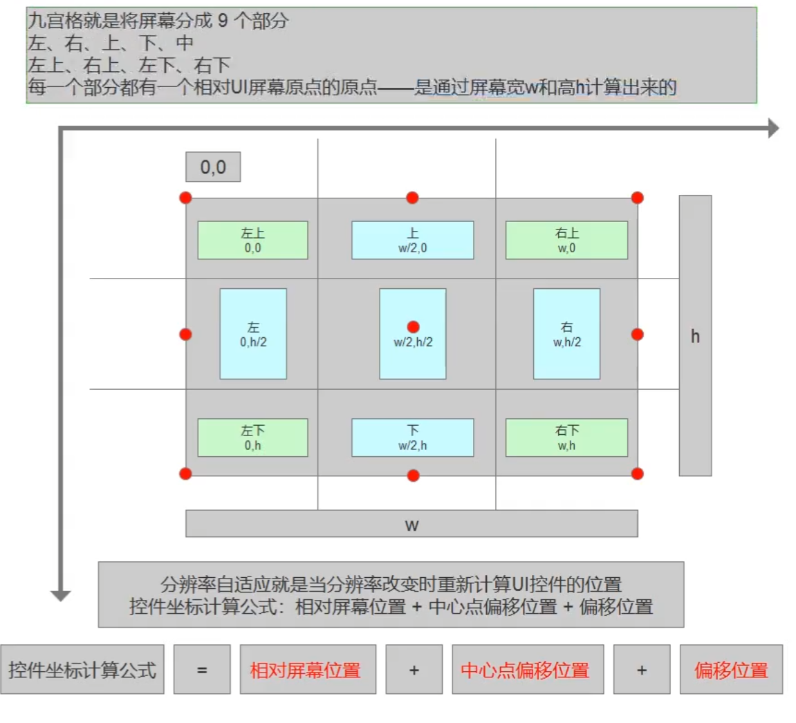
实际设计
位置信息类
c#
/// <summary>
/// 表示对齐方式
/// </summary>
public enum AlignmentType
{
	UpLeft,
	Up,
	UpRight,
	Left,
	Center,
	Right,
	DownLeft,
	Down,
	DownRight
}

/// <summary>
/// 用于表示并计算位置信息
/// </summary>
[System.Serializable]
public class CustomGUIPos
{
	// 屏幕对齐方式
	[SerializeField] private AlignmentType screenAlignment = AlignmentType.UpLeft;

	// 组件原点对齐方式
	[SerializeField] private AlignmentType componentOriginAlignment = AlignmentType.UpLeft;

	// 位置偏移量
	[SerializeField] private Vector2 offset = Vector2.zero;

	[SerializeField] private float width;
	[SerializeField] private float height;

	// 实际位置矩形
	private Rect _realPosition;

	// 组件原点位置
	private Vector2 _originPosition;

	/// <summary>
	/// 根据组件原点对齐方式计算原点位置
	/// </summary>
	/// <returns>原点坐标</returns>
	private Vector2 CalculateOriginPosition()
	{
		return componentOriginAlignment switch
		{
			AlignmentType.UpLeft => Vector2.zero,
			AlignmentType.Up => new Vector2(width / 2, 0),
			AlignmentType.UpRight => new Vector2(width, 0),
			AlignmentType.Left => new Vector2(0, height / 2),
			AlignmentType.Center => new Vector2(width / 2, height / 2),
			AlignmentType.Right => new Vector2(width, height / 2),
			AlignmentType.DownLeft => new Vector2(0, height),
			AlignmentType.Down => new Vector2(width / 2, height),
			AlignmentType.DownRight => new Vector2(width, height),
			_ => Vector2.zero
		};
	}

	/// <summary>
	/// 根据屏幕对齐方式计算实际位置
	/// </summary>
	private void CalculateRealPosition()
	{
		switch (screenAlignment)
		{
			case AlignmentType.UpLeft:
				_realPosition.x = -_originPosition.x + offset.x;
				_realPosition.y = -_originPosition.y + offset.y;
				break;
			case AlignmentType.Up:
				_realPosition.x = Screen.width / 2f - _originPosition.x + offset.x;
				_realPosition.y = -_originPosition.y + offset.y;
				break;
			case AlignmentType.UpRight:
				_realPosition.x = Screen.width - _originPosition.x - offset.x;
				_realPosition.y = -_originPosition.y + offset.y;
				break;
			case AlignmentType.Left:
				_realPosition.x = -_originPosition.x + offset.x;
				_realPosition.y = Screen.height / 2f - _originPosition.y + offset.y;
				break;
			case AlignmentType.Center:
				_realPosition.x = Screen.width / 2f - _originPosition.x + offset.x;
				_realPosition.y = Screen.height / 2f -_originPosition.y + offset.y;
				break;
			case AlignmentType.Right:
				_realPosition.x = Screen.width - _originPosition.x - offset.x;
				_realPosition.y = Screen.height / 2f - _originPosition.y + offset.y;
				break;
			case AlignmentType.DownLeft:
				_realPosition.x = -_originPosition.x + offset.x;
				_realPosition.y = Screen.height - _originPosition.y - offset.y;
				break;
			case AlignmentType.Down:
				_realPosition.x = Screen.width / 2f - _originPosition.x + offset.x;
				_realPosition.y = Screen.height - _originPosition.y - offset.y;
				break;
			case AlignmentType.DownRight:
				_realPosition.x = Screen.width - _originPosition.x - offset.x;
				_realPosition.y = Screen.height - _originPosition.y - offset.y;
				break;
		}
	}

	/// <summary>
	/// 获取计算后的实际位置矩形
	/// </summary>
	public Rect RealPosition
	{
		get
		{
			_originPosition = CalculateOriginPosition();
			CalculateRealPosition();
			_realPosition.width = width;
			_realPosition.height = height;
			return _realPosition;
		}
	}

}控件基类
c#
public class CustomGUIControl : MonoBehaviour
{
	// 位置信息
	[SerializeField] private CustomGUIPos customGUIPos;

	// 组件内容
	[SerializeField] private GUIContent guiContent;

	// 自定义样式是否启用
	[SerializeField] private bool useCustomStyle;

	// 自定义样式
	[SerializeField] private GUIStyle guiStyle;

	public void DrawUI()
	{
		if (useCustomStyle)
		{
			DrawCustomGUI();
		}
		else
		{
			DrawNormGUI();
		}
	}

	protected virtual void DrawNormGUI()
	{
		// 绘制标准GUI
	}

	protected virtual void DrawCustomGUI()
	{
		// 在这里实现自定义GUI绘制逻辑
	}
}绘制所有控件的Root类
c#
[ExecuteAlways]
public class CustomGUIRoot : MonoBehaviour
{
    private CustomGUIControl[] _customGUIControls;

    private void Start()
    {
        _customGUIControls = GetComponentsInChildren<CustomGUIControl>();
    }

    private void OnGUI()
    {
        if (!Application.isPlaying)
        {
            // 仅在编辑模式下不断获取子组件,以节省性能
            _customGUIControls = GetComponentsInChildren<CustomGUIControl>();
        }

        foreach (var control in _customGUIControls)
        {
            control.DrawUI();
        }
    }
}控件示例 - Button
c#
public class CustomGUIButton : CustomGUIControl
{
	public event Action Click;

	protected virtual void OnClick()
	{
		Click?.Invoke();
	}

	protected override void DrawNormGUI()
	{
		if (GUI.Button(customGUIPos.RealPosition, guiContent))
		{
			OnClick();
		}
	}

	protected override void DrawCustomGUI()
	{
		if (GUI.Button(customGUIPos.RealPosition, guiContent, guiStyle));
		{
			OnClick();
		}
	}
}:::
结束!
更新: 1/20/2026 字数: 0 字 时长: 0 分钟